Histogram Plotting#
One of the main features of VectoRose is the ability to construct histograms. In this page, we’ll discuss the different types of histograms that can be constructed using VectoRose.
Much Ado About Histograms#
Before we get too in-depth about VectoRose, let’s talk about histograms. Histograms are a data visualisation tool that present the frequency of all possible data values.
Let’s look at a simple 1D case. Let’s say we have measurements of individual heights. We can easily build a 1D histogram, consisting of equal-width bars. Each bar has a height proportional to the number of individuals with a height in the range covered by the respective bin.
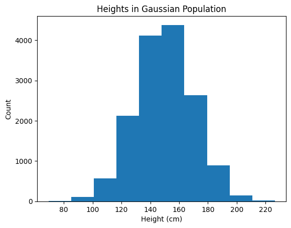
Heights in a very Gaussian population.#
This hopefully should not come as a surprise, as these types of histograms are quite common. One thing that is important to note is that this histogram of 1D data is actually a 2D plot (heights and counts).
Tip
This type of histogram can be used to visualise 1D data, such as heights, weights, … or vector magnitudes.
Well, what about slightly more complicated data? Let’s say we meet a group of people and measure their heights and weights. We now have a collection of data pairs, or two measured variables. While we can plot the heights and widths separately, looking at these two variables separately doesn’t give the whole picture. The measurements may be correlated, and certain values of height may be more common for certain values of weight. As a solution, we can produce a 2D histogram, like so:
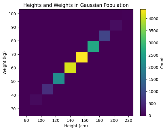
Heights and weights in a very Gaussian population.#
This 2D histogram is essentially an image, where each pixel represents a range of height and weight values. The colour intensity reflects the number of measurements falling into that bin for both variables. This plot can be thought of as three-dimensional (height, weight, count). Alternatively, this histogram can be plotted using a surface, with the heights corresponding to the bin counts.
Tip
The important idea here is that a histogram plot is always one dimension higher than the data it represents. The plot must be able to capture all possible data values and represent the counts or frequencies of the observed data.
Magnitude Histograms#
As we saw in our Introduction to Vectors, vectors
have a scalar magnitude. We can easily construct a histogram to show the
frequencies of different vector magnitudes. We can use functions in NumPy
to bin the data. Here, we’ll use numpy.histogram(). VectoRose
includes the function produce_1d_scalar_histogram() in the
plotting module that can be used to plot the histogram.
Throughout this section of the Users’ Guide, we’ll do a running example
using some random vectors stored in the file
two_clusters.npy. These vectors are also
bundled in the data module, as SampleData.TWO_CLUSTERS and
so we can access them without downloading any extra files.
Before getting into the histogram plots, let’s load these vectors from the file. We’ll assume that the represent vectorial data, but we’ll still make sure to remove any zero-vectors.
Attention
As always, remember to start your code with import vectorose as vr to be
able to access everything included in VectoRose.
import vectorose as vr
import vectorose.data
# Load the vectors
my_vectors = vr.data.SampleData.TWO_CLUSTERS.load()
my_vectors = vr.util.remove_zero_vectors(my_vectors)
my_vectors
array([[ 0.01330902, 0.06486094, -0.08154041],
[ 0.19911095, 0.06809676, -0.02230348],
[ 0.14568445, 0.08995054, 0.06688315],
...,
[-0.0377645 , 0.35891606, 0.6731566 ],
[-0.13033349, 0.56234415, 0.27104764],
[-0.03287074, 0.60723468, 0.63249369]], shape=(200000, 3))
Before we can construct the histogram, we must compute the vector
magnitudes. We can do this using numpy.linalg.norm():
import numpy as np
magnitudes = np.linalg.norm(my_vectors, axis=-1)
magnitudes
array([0.10503766, 0.21161234, 0.18381625, ..., 0.76379755, 0.63771826,
0.8774182 ], shape=(200000,))
Note
We must set axis=-1 to compute the magnitude of each vector individually.
We can now compute the histogram. Let’s consider 10 bins.
magnitude_counts, magnitude_bins = np.histogram(magnitudes, bins=10)
magnitude_counts
array([ 8112, 51235, 49705, 27705, 30856, 21825, 8485, 1852, 210,
15])
Using VectoRose, we can generate the 1D plot using the plotting.
ax = vr.plotting.produce_1d_scalar_histogram(
magnitude_counts, magnitude_bins
)
ax.set_title("Magnitude Histogram")
ax.set_xlabel("Magnitude")
ax.set_ylabel("Count")
plt.show()
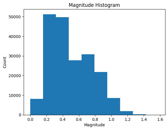
These scalar histograms give us some very basic insight into our collection of vectors. We can tell how many vectors have high magnitudes and low magnitudes. But, this is just the beginning of what we can learn from vectors.
Direction and Orientation Histograms#
So, we’ve now seen how to generate histograms of scalar data. While these can provide insight into vector magnitudes, they aren’t effective for studying orientations and directions. It is important to recall that directions and orientations are not scalar values.
As we explained in our Introduction to Vectors, we can represent orientations and directions in spherical coordinates using two angles:
\(\phi\) - the angle of inclination from the positive z-axis, known as the colatitude.
\(\theta\) - the clockwise angle in the xy-plane, measured from the positive y-axis, known as the azimuthal angle.
Note
Recall the valid angular ranges for each angle:
\(0^\circ \leq \theta < 360^\circ\) for both vectorial and axial data.
\(0^\circ \leq \phi \leq 180^\circ\) for vectorial data; \(0^\circ \leq \phi \leq 90^\circ\) for axial data.
We can analyse these angles separately using polar histograms, or we can analyse the true directions and orientations using spherical histograms.
Polar Histograms#
We can start by studying the two angles \(\phi\) and \(\theta\) separately. While these values can be plotted on a conventional linear histogram, this doesn’t fully represent the data we are studying. On a linear histogram, the angles 2° and 358° are very far from each other, but in reality, they are only 4° apart!
To take advantage of the circular nature of angles we can use polar histograms. These histograms are circular and show bars radiating from the centre of the circle. The bar heights still reflect the proportion of vectors having an angle in each bin. These plots allow simpler interpretation and better representation of the data.
In VectoRose, we can construct polar histograms using the
polar_data module, and we can visualise the results using
functions from the plotting module.
The process begins with the PolarDiscretiser
class. When constructing this class, you must specify the number of angular
bins to consider for both \(\phi\) and \(\theta\), and indicate whether the
data under consideration are axial.
Returning to our example, we can discretise our loaded vectors based
on orientation using PolarDiscretiser. The
first step is to create an object from this class, and then we must pass
our vectors to the method PolarDiscretiser.assign_histogram_bins().
This method produces a new table of vectors with some extra columns,
providing the spherical coordinates of each vector, as well as the angular
bin for both \(\phi\) and \(\theta\).
# Begin the process of constructing the angular histograms
my_polar_discretiser = vr.polar_data.PolarDiscretiser(
number_of_phi_bins=18,
number_of_theta_bins=36,
is_axial=False
)
my_labelled_vectors = my_polar_discretiser.assign_histogram_bins(my_vectors)
my_labelled_vectors
| vx | vy | vz | phi | theta | magnitude | phi_bin | theta_bin | |
|---|---|---|---|---|---|---|---|---|
| 0 | 0.013309 | 0.064861 | -0.081540 | 140.922763 | 11.595749 | 0.105038 | 13 | 1 |
| 1 | 0.199111 | 0.068097 | -0.022303 | 96.050088 | 71.119103 | 0.211612 | 9 | 7 |
| 2 | 0.145684 | 0.089951 | 0.066883 | 68.662637 | 58.307407 | 0.183816 | 6 | 5 |
| 3 | 0.228730 | 0.140701 | -0.090572 | 108.637973 | 58.402654 | 0.283404 | 10 | 5 |
| 4 | 0.184200 | 0.231029 | -0.060656 | 101.600750 | 38.565368 | 0.301634 | 9 | 3 |
| ... | ... | ... | ... | ... | ... | ... | ... | ... |
| 199995 | -0.674853 | 0.550216 | 0.303995 | 70.754479 | 309.190779 | 0.922267 | 6 | 30 |
| 199996 | -0.081296 | 0.511040 | 0.737496 | 35.055502 | 350.961121 | 0.900928 | 3 | 35 |
| 199997 | -0.037765 | 0.358916 | 0.673157 | 28.196955 | 353.993542 | 0.763798 | 2 | 35 |
| 199998 | -0.130333 | 0.562344 | 0.271048 | 64.847612 | 346.951053 | 0.637718 | 6 | 34 |
| 199999 | -0.032871 | 0.607235 | 0.632494 | 43.874659 | 356.901498 | 0.877418 | 4 | 35 |
200000 rows × 8 columns
Now we see that each vector has been assigned an angular bin. Remember, in
Python indexing starts at zero, so the first bin has index 0.
This process has produced a labelling for each vector, but it hasn’t yet
given us a histogram. We can compute the \(\phi\) and \(\theta\) histograms,
respectively, using the methods
PolarDiscretiser.construct_phi_histogram() and
PolarDiscretiser.construct_theta_histogram(). First, let’s look at
the \(\phi\) histogram:
phi_histogram = my_polar_discretiser.construct_phi_histogram(my_labelled_vectors)
phi_histogram
| start | end | count | frequency | |
|---|---|---|---|---|
| 0 | 0.000000 | 10.588235 | 601 | 0.003005 |
| 1 | 10.588235 | 21.176471 | 2883 | 0.014415 |
| 2 | 21.176471 | 31.764706 | 8430 | 0.042150 |
| 3 | 31.764706 | 42.352941 | 16857 | 0.084285 |
| 4 | 42.352941 | 52.941176 | 24038 | 0.120190 |
| 5 | 52.941176 | 63.529412 | 24765 | 0.123825 |
| 6 | 63.529412 | 74.117647 | 20500 | 0.102500 |
| 7 | 74.117647 | 84.705882 | 16156 | 0.080780 |
| 8 | 84.705882 | 95.294118 | 15502 | 0.077510 |
| 9 | 95.294118 | 105.882353 | 16916 | 0.084580 |
| 10 | 105.882353 | 116.470588 | 17180 | 0.085900 |
| 11 | 116.470588 | 127.058824 | 14611 | 0.073055 |
| 12 | 127.058824 | 137.647059 | 10354 | 0.051770 |
| 13 | 137.647059 | 148.235294 | 6371 | 0.031855 |
| 14 | 148.235294 | 158.823529 | 3201 | 0.016005 |
| 15 | 158.823529 | 169.411765 | 1272 | 0.006360 |
| 16 | 169.411765 | 180.000000 | 363 | 0.001815 |
| 17 | 180.000000 | 190.588235 | 0 | 0.000000 |
And now, for the theta histogram:
theta_histogram = my_polar_discretiser.construct_theta_histogram(my_labelled_vectors)
theta_histogram
| start | end | count | frequency | |
|---|---|---|---|---|
| 0 | 0.0 | 10.0 | 17997 | 0.089985 |
| 1 | 10.0 | 20.0 | 17289 | 0.086445 |
| 2 | 20.0 | 30.0 | 15713 | 0.078565 |
| 3 | 30.0 | 40.0 | 14854 | 0.074270 |
| 4 | 40.0 | 50.0 | 14722 | 0.073610 |
| ... | ... | ... | ... | ... |
| 31 | 310.0 | 320.0 | 3125 | 0.015625 |
| 32 | 320.0 | 330.0 | 5878 | 0.029390 |
| 33 | 330.0 | 340.0 | 9706 | 0.048530 |
| 34 | 340.0 | 350.0 | 13950 | 0.069750 |
| 35 | 350.0 | 0.0 | 17109 | 0.085545 |
36 rows × 4 columns
Notice that the bins reflect the different angular ranges of \(\phi\) and \(\theta\). For each histogram, we have the start and end angles of each bin, as well as the count and frequency associated with each.
At this point, you may be thinking, “this is great, but I signed up for
a histogram plot, not just a table of numbers!” Well, now we switch
over to the functions in vectorose.plotting to visualise our polar
histograms. The individual histograms can be constructed separately using
the function produce_polar_histogram_plot(), or together using the
function produce_phi_theta_polar_histogram_plots(). We’ll
demonstrate the latter.
phi_theta_figure = vr.plotting.produce_phi_theta_polar_histogram_plots(
phi_histogram, theta_histogram
)
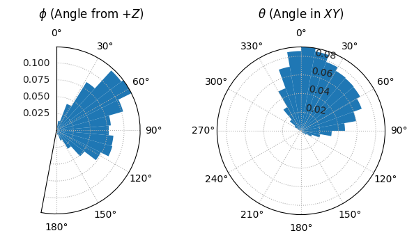
We now have two polar histogram plots showing the distribution of our data.
For the ability to customise these plots, check out all the parameters for
produce_phi_theta_polar_histogram_plots(), and for more flexibility
consult produce_polar_histogram_plot().
Tip
For more information about plotting and analysing circular data, check out Fisher [1995].
Spherical Histograms#
These polar histograms provide some insight into the directions present, but like in the discussion about height and weight above, looking at these angles separately doesn’t give us a perfect picture of how the data are arranged in space. We need to visualise both angles together… on a sphere.
As we mentioned in the Introduction to Vectors, the two angles describing direction and orientation can also describe positions on a sphere (or hemisphere). So, to visualise the freqencies associated with each orientation, we need to take a sphere and colour its surface in different patches to reflect the number of vectors present within each orientation bin.
And so, this brings up an important question: how can we tile a sphere?
Tiling the Sphere#
The answer is not so trivial. There are many different ways to divide the surface of a sphere.
UV Spheres#
The simplest way is to wrap a flat 2D histogram onto a sphere. In this case, we would define a constant angular bin width for \(\phi\) and another constant angular bin width in \(\theta\), and overlay a grid on the sphere. This is similar to overlaying the latitude and longitude lines onto the surface of a globe. In computer graphics, this type of sphere is known as a UV sphere.
This type of sphere is trivial to construct and the histogram simply involves considering the pairs of \(\phi\) and \(\theta\) bins computed in the polar case. However, the faces in the sphere have very different surface areas. The bins at the equator are much larger than those at the poles. This leads to difficulties in interpretation: does a larger patch have a higher count due to properties of the data, or simply by virtue of the fact that it is larger?
Triangulated Spheres#
So, the UV sphere is very problematic. An alternative solution involves tiling the sphere using triangles, as is done in a geodesic dome (Montreal, where we have developed this package, is quite famous for one). In this tiling, all faces are triangular and are similar (but not identical) in area.
Unfortunately, the triangles are not defined as a simple function of the spherical coordinates, which makes the binning process more complicated.
Tregenza Sphere#
To resolve the issues present with the UV, continuing work undertaken by Tregenza [1987], Beckers and Beckers [2012] developed a new incongruent method to approximate a sphere using rectangular patches of near-equal area. Beckers and Beckers [2012] first divided the sphere into a series of rings using almucantars based on a constant angle of inclination. Each ring is then subdivided into rectangular patches based on a consistent azimuthal angle specific to that ring. This pattern achieves near-equal area patch sizing across the entire sphere. Instead of a triangular fan, the sphere pole is filled with a single polygonal cap, approximating a small circle.
Although this technique reduces most discrepancies in face area, near the pole, face areas may still deviate by up to 21%. We have modified the approach presented by Beckers and Beckers [2012] to ensure that the top rings of the sphere better approximate equal-area patching. While a consistent \(\phi\)-spacing is maintained for bins close to the equator, we manually set a smaller inclination angle for the first two rings to ensure that the face areas are closer to being equal. We have implemented three levels of granularity for these spheres:
Coarse - contains 18 rings and 520 patches.
Fine - contains 54 rings and 5806 patches.
Ultra fine - contains 124 rings and 36956 patches.
Using our modified technique, patch areas are more similar, but minor area deviations can persist in each sphere.
Although this representation of the sphere may appear more complicated, since each ring is defined in terms of a start and end \(\phi\) angle and each bin within a ring has the same \(\theta\) width, assigning histogram bins remains very straightforward:
First the \(\phi\) angle is used to determine the appropriate ring.
Then the \(\theta\) angle is used to determine the closest bin within the ring almucantar.
Similar to the UV sphere, but unlike the triangulated sphere, this representation has a visible sphere pole above a series of rings of rectangular patches.
Comparison#
As we discussed, an important criterion for a spherical histogram is that the sphere faces have approximately equal area. We can construct each and look at the deviations from the average area in each.
Constructing Spherical Histograms#
Now that we’ve discussed how to tile the sphere, we can actually construct
histograms on these spheres. In VectoRose, we provide tools to produce
histograms on both the triangulated sphere and the Tregenza sphere.
The triangulated sphere is represented using the class
triangle_sphere.TriangleSphere while the Tregenza sphere is
defined using tregenza_sphere.TregenzaSphere. For simplicity, we
have provided three levels of discretisation for the Tregenza sphere,
discussed above. These are implemented as CoarseTregenzaSphere,
FineTregenzaSphere and UltraFineTregenzaSphere.
Both TregenzaSphere and TriangleSphere inherit from the
abstract class sphere_base.SphereBase, which defines all the
functions necessary for computing orientation histograms. As a result, the
workflow is very similar for both; we will demonstrate using the fine
Tregenza sphere.
First, to be able to construct the spherical histogram, we must create a sphere object. Since we are using the Tregenza sphere, we run the following code:
my_sphere = vr.tregenza_sphere.FineTregenzaSphere()
We can view the structure of the sphere by converting it to a pandas
DataFrame object using the
TregenzaSphere.to_dataframe() method:
my_sphere.to_dataframe()
| bins | start | end | theta_inc | face_area | weight | regular | |
|---|---|---|---|---|---|---|---|
| ring | |||||||
| 0 | 1 | 0.00 | 1.50 | 360.000000 | 0.002153 | 1.000000 | False |
| 1 | 6 | 1.50 | 4.00 | 60.000000 | 0.002192 | 0.982217 | False |
| 2 | 17 | 4.00 | 7.44 | 21.176471 | 0.002211 | 0.973664 | False |
| 3 | 27 | 7.44 | 10.88 | 13.333333 | 0.002224 | 0.968176 | True |
| 4 | 38 | 10.88 | 14.32 | 9.473684 | 0.002165 | 0.994383 | True |
| ... | ... | ... | ... | ... | ... | ... | ... |
| 49 | 38 | 165.68 | 169.12 | 9.473684 | 0.002165 | 0.994383 | True |
| 50 | 27 | 169.12 | 172.56 | 13.333333 | 0.002224 | 0.968176 | True |
| 51 | 17 | 172.56 | 176.00 | 21.176471 | 0.002211 | 0.973664 | False |
| 52 | 6 | 176.00 | 178.50 | 60.000000 | 0.002192 | 0.982217 | False |
| 53 | 1 | 178.50 | 180.00 | 360.000000 | 0.002153 | 1.000000 | False |
54 rows × 7 columns
Now we can see exactly how our sphere is made. This sphere gives us a tool
that we can use to assign histogram bins, similar to what we did earlier
in the Polar Histograms section. Let’s assign our
vectors, which are still stored in the variable my_vectors, to histogram
bins using the method SphereBase.assign_histogram_bins(). This
function produces two outputs: labelled vectors and bins for a magnitude
histogram. We’ll worry about the second one
a bit later.
labelled_vectors, _ = my_sphere.assign_histogram_bins(my_vectors)
labelled_vectors
| phi | theta | magnitude | shell | ring | bin | |
|---|---|---|---|---|---|---|
| 0 | 140.922763 | 11.595749 | 0.105038 | 0 | 41 | 3 |
| 1 | 96.050088 | 71.119103 | 0.211612 | 0 | 28 | 34 |
| 2 | 68.662637 | 58.307407 | 0.183816 | 0 | 20 | 26 |
| 3 | 108.637973 | 58.402654 | 0.283404 | 0 | 32 | 26 |
| 4 | 101.600750 | 38.565368 | 0.301634 | 0 | 30 | 18 |
| ... | ... | ... | ... | ... | ... | ... |
| 199995 | 70.754479 | 309.190779 | 0.922267 | 0 | 21 | 141 |
| 199996 | 35.055502 | 350.961121 | 0.900928 | 0 | 11 | 101 |
| 199997 | 28.196955 | 353.993542 | 0.763798 | 0 | 9 | 85 |
| 199998 | 64.847612 | 346.951053 | 0.637718 | 0 | 19 | 151 |
| 199999 | 43.874659 | 356.901498 | 0.877418 | 0 | 13 | 118 |
200000 rows × 6 columns
Now we can see that each vector has some extra data: we have the spherical coordinates, as well as columns for the ring and bin that each vector falls in. We’ll discuss later what the shell means.
We can now gather these labelled vectors into a histogram using
SphereBase.construct_histogram(). We can choose to either get the
actual number of vectors in each face, or the fraction of vectors in each
face.
my_histogram = my_sphere.construct_histogram(labelled_vectors)
my_histogram.to_frame()
| frequency | |||
|---|---|---|---|
| shell | ring | bin | |
| 0 | 0 | 0 | 0.000035 |
| 1 | 0 | 0.000070 | |
| 1 | 0.000045 | ||
| 2 | 0.000050 | ||
| 3 | 0.000035 | ||
| ... | ... | ... | |
| 52 | 2 | 0.000035 | |
| 3 | 0.000025 | ||
| 4 | 0.000020 | ||
| 5 | 0.000015 | ||
| 53 | 0 | 0.000040 |
5806 rows × 1 columns
Looking at this table isn’t terribly informative. To visualise the
orientation histogram in 3D, we need to construct a sphere mesh with the
corresponding face values. We can easily do this using the method
SphereBase.create_histogram_meshes().
my_histogram_meshes = my_sphere.create_histogram_meshes(
my_histogram, magnitude_bins=None
)
We can now visualise the histogram using the SpherePlotter class
in the plotting module.
Tip
The histogram is a pandas.Series object, so you can leverage all
the functions defined by pandas to export these data.
Let’s produce the histogram plot. First, we need to create a
SpherePlotter object with the histogram meshes. Then, we must
create the plot using the SpherePlotter.produce_plot() method, and
then we can show the plot using SpherePlotter.show().
my_sphere_plotter = vr.plotting.SpherePlotter(my_histogram_meshes)
my_sphere_plotter.produce_plot()
my_sphere_plotter.show()
Danger
In order to add the spherical histogram to the plot, you must call the
SpherePlotter.produce_plot() method. Otherwise, no spheres will
appear!
There are different parameters for each method. Please consult the documentation for each method to learn about all the parameters.
Tip
Confused about the angles? You can add spherical axes showing the \(\phi\)
and \(\theta\) labels and ticks using the method
SpherePlotter.add_spherical_axes().
So, we now have 3D sphere plots! You are probably wondering how you can take these beautiful plots and share them with the world. Good news! VectoRose allows you to easily export images and videos of your spherical histograms.
To export your plot as a raster image (PNG, TIFF, JPEG, BMP) you may call
the method SpherePlotter.export_screenshot(). To preserve any
text annotations, you can also export the image as a vector graphic (PDF,
SVG and more) using SpherePlotter.export_graphic(). Finally, you can
export a video of your sphere spinning about its vertical axis using
SpherePlotter.produce_rotating_video().
my_sphere_plotter.produce_rotating_video(
"./assets/rotating_video/rotating_video.mp4",
quality=5,
fps=12,
number_of_frames=36,
hide_sliders=True
)
Each function has a number of possible parameters. Please consult the documentation for each.
See also
Orientation histograms can also be plotted in 3D using Matplotlib. Check
out the functions plotting.produce_3d_triangle_sphere_plot() and
plotting.produce_3d_tregenza_sphere_plot().
The workflow for using a triangulated sphere is almost identical. Simply
replace the FineTregenzaSphere with TriangleSphere in
the code above.
Logarithmic Scale Colour Mapping#
In our previous example, the spherical histogram used a linear colour scale. In certain cases other cases, the values may be spread over a large range. It may be beneficial to colour the sphere faces using a logarithmic scale. Using VectoRose, it’s easy to create a spherical histogram with a log scale.
Attention
The log scale relies on the logarithmic function \(y = \log(x)\). This function is defined for all input values between zero and positive infinity and produces all real numbers as output. Very importantly, the logarithm is not defined at zero.
Caution
There are currently some issues with plotting histograms that contain faces
with a value of zero. As part of the plotting process, we currently set all
zero-valued faces to have a value of numpy.nan. This will be
corrected in a future release. The minimum for the colour bar is
automatically set to the smallest non-zero value in the dataset. Any faces
coloured with the NaN colour correspond to faces with a value of zero.
The key step for generating log scale plots is to set
use_log_scale=True when calling
SpherePlotter.produce_plot(). Here are two examples using our set of
vectors.
First, let’s use the frequencies that we computed earlier:
my_sphere_plotter = vr.plotting.SpherePlotter(my_histogram_meshes)
my_sphere_plotter.produce_plot(use_log_scale=True)
Now, let’s recompute the histogram using counts instead. We’ll call the
method SphereBase.construct_histogram(), but this time with
return_fraction=False. Then, we’ll regenerate the meshes and
plot them.
my_histogram = my_sphere.construct_histogram(
labelled_vectors, return_fraction=False
)
my_histogram_meshes = my_sphere.create_histogram_meshes(
my_histogram, magnitude_bins=None
)
my_sphere_plotter = vr.plotting.SpherePlotter(my_histogram_meshes)
my_sphere_plotter.produce_plot(use_log_scale=True)
Notice that in both cases, the colour bar automatically adjust to show the correct, non-linear scale. The plots also appear more saturated.
Vector Histograms#
We’ve now seen how to construct 1D histograms of vector magnitude and spherical histograms of vector orientation. Each of these gives us important information, but studying how they relate to each other may provide us with additional insight.
So, how can we study the two together?
Like we said before, a histogram has to show the frequency at all possible data values. In the case of non-unit vectors, then we need to find a way of showing the frequency at all possible combinations of orientation and magnitude.
In VectoRose, we do this by creating nested spherical histograms. Each spherical shell represents a certain magnitude level, with the smallest, innermost sphere corresponding to the lowest-magnitude vectors and the largest, outermost sphere corresponding to the highest-magnitude vectors. By default, the colour map is universal, colouring each sphere patch based on the frequency across all shells and all faces.
To generate spheres with multiple shells, we can use the same sphere
objects as before, TriangleSphere and TregenzaSphere.
The important thing is to now pass the number_of_shells parameter.
Let’s now take our same vectors from before, and consider ten histogram shells.
my_sphere = vr.tregenza_sphere.FineTregenzaSphere(number_of_shells=10)
labelled_vectors, magnitude_bin_edges = my_sphere.assign_histogram_bins(my_vectors)
labelled_vectors
| phi | theta | magnitude | shell | ring | bin | |
|---|---|---|---|---|---|---|
| 0 | 140.922763 | 11.595749 | 0.105038 | 0 | 41 | 3 |
| 1 | 96.050088 | 71.119103 | 0.211612 | 1 | 28 | 34 |
| 2 | 68.662637 | 58.307407 | 0.183816 | 1 | 20 | 26 |
| 3 | 108.637973 | 58.402654 | 0.283404 | 1 | 32 | 26 |
| 4 | 101.600750 | 38.565368 | 0.301634 | 1 | 30 | 18 |
| ... | ... | ... | ... | ... | ... | ... |
| 199995 | 70.754479 | 309.190779 | 0.922267 | 5 | 21 | 141 |
| 199996 | 35.055502 | 350.961121 | 0.900928 | 5 | 11 | 101 |
| 199997 | 28.196955 | 353.993542 | 0.763798 | 4 | 9 | 85 |
| 199998 | 64.847612 | 346.951053 | 0.637718 | 4 | 19 | 151 |
| 199999 | 43.874659 | 356.901498 | 0.877418 | 5 | 13 | 118 |
200000 rows × 6 columns
Here there are a couple of small differences from our previous demonstration:
The keyword argument
number_of_shells=10specifies that we want 10 magnitude shells.We store the magnitude bin edges from the bin assignment in a variable
magnitude_bin_edges.Our labelled vectors now have non-zero values in the shell column.
Attention
When assigning the magnitude bins, we exclude the lower bin limit and include the upper bin limit. This is done to avoid counting zero-length vectors.
We now once again need to create the histogram using
SphereBase.construct_histogram().
my_histogram = my_sphere.construct_histogram(labelled_vectors)
To plot the spherical histogram, we once again have to generate the
histogram meshes using SphereBase.create_histogram_meshes().
my_histogram_meshes = my_sphere.create_histogram_meshes(
my_histogram, magnitude_bins=magnitude_bin_edges
)
We pass in the magnitude_bin_edges to be able to set the radius for each
sphere.
As before, we can use the SpherePlotter to visualise the plots.
my_sphere_plotter = vr.plotting.SpherePlotter(my_histogram_meshes)
my_sphere_plotter.produce_plot()
my_sphere_plotter.show()
Our plot is similar, but we now have sliders that can help us activate individual shells and adjust the opacity of the active shell and the inactive shell.
Attention
If you’re reading this page on our website in a web browser, you probably
can’t see the sliders. This is normal due to how the static documentation
is rendered. To be able to take full advantage of the plotting features,
open this file using Jupyter Lab or Jupyter Notebooks, and make sure to
set the backend to "trame" instead of "html" at the top of the file.
In addition to everything that we can do with a spherical histogram, we can
also export a video that iterates through the different shells using the
method SpherePlotter.produce_shells_video().
my_sphere_plotter.produce_shells_video(
"./assets/shells_video/shells_video.mp4",
quality=5,
fps=4,
boomerang=True,
add_shell_text=True,
hide_sliders=True
)
In this plot, we see not only where the vectors are pointing and what their magnitudes are, but the combination of the two. We can see which orientations are associated with higher magnitudes. This information could be useful in downstream analyses.
In some cases, the signal may be quite low on some of the shells. In order
to make the patterns more visible, the frequency values may be normalised
within each shell. This option is set when generating the histogram meshes
using the keyword argument normalise_by_shell=True in
SphereBase.create_histogram_meshes(). In this case, all faces have a
value between 0 and 1, representing the fraction of the shell maximum value
stored in the face.
Tip
We’ll see more about what these normalised face values mean in the next section.
Clean-Up and Summary#
One last thing: when you’re done plotting, make sure to close the sphere
plotter using the SpherePlotter.close() method.
my_sphere_plotter.close()
By doing this, you can make sure that the resources used to generate the plot are freed up. This will make it easier to produce additional plots.
Now we’ve seen how to generate 1D, spherical and nested spherical
histograms. In the next section, we’ll see a bit more about how to generate
these histograms from a single SphereBase object and how to gain
additional insights.